The February meeting explored the age old problem of representing ever moving time with but a single still image. The meeting was very well attended, and six members presented work for the review.
Dainis presented a number of different techniques, and I found this multiple exposure to be the most effective.

Everyone is familiar with flags waving in the wind. As the wind increases, the gentle waving turns into a manic flapping. Back in the day, multiple exposures were an all too common error with manually operated cameras. Now a days, it is almost impossible to even make a multiple exposure with an electronic camera, and the effect must be created in after capture in Photoshop. This picture seems to create the impression of a flag beating in a strong wind more effectively than either a stop action or a motion blur, does it not?
Marilyn presented a variety of ways to indicate action, but I found this series of a butterfly drawing nectar from a flower to be the most instructive.

This close up stop action shot is wonderfully revealing of detail on a beautiful flower and butterfly, showing a marvelous pattern that might not be seen at all by the naked eye.
On the other hand, is not this blurred shot more illustrative of a live butterfly as it darts and flits from flower to flower in nature? Has anyone discarded this kind of photo with barely a glance, perhaps prematurely?

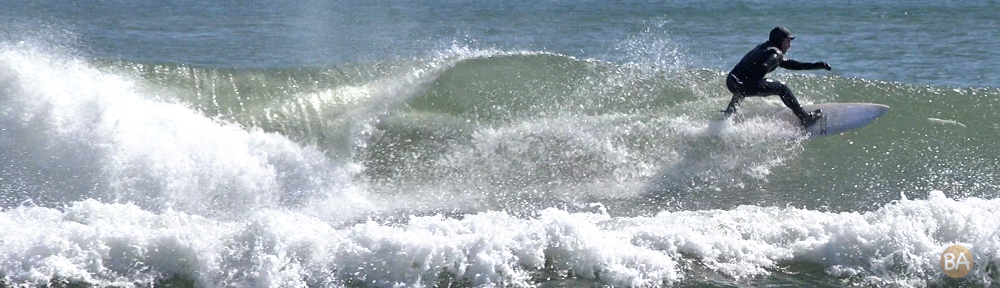
Bridg presented several interesting ways of showing time. One was a stop action video that compressed a year of construction into a few minutes of video in a way that was more illustrative of the job than either a still shot or a conventional video.
He also showed what can happen when everything is just right in a high speed shot. The most dramatic moment in the launching of a ship is when it leaves the ways and splashes into the usually still harbor waters with a tremendous splash. This strong diagonal composition, and perfect timing capture the moment perfectly, showing a moment in time with more impact than a fleeting frame in a moving image.
Yvette used an entirely different technique to define a moment: soft focus.
By eliminating all normal “photographic” detail from this photograph, the more significant body language comes to the fore, making this image more painterly, and this special moment more memorable.
Perfect stillness is harder to portray than may be imagined. We use the expression “still life” to describe a scene that has been consciously composed to allow a careful portrayal, either by painter or photographer.
But when shooting natural scenes, the there is a difference between simply showing a scene with no movement in it, and the indication of that perfect, quiet, stillness that so rarely occurs. Perfectly flat water, water as flat as a mirror, actually occurs in nature rather infrequently. In this shot that perfectly calm water may
promote the sense memory of a particularly silent moment on a still and chilly autumnal morning.
THE ASSIGNMENT:
Back in the day, photography was entirely a black and white affair. From it’s earliest days in the 1830’s until the wide use of Kodachrome after World War II, there was very little color in photography, and none at all available to the general public.
From the 1950’s to the seventies, the 35mm color slide was the standard way of taking color pictures, until the ubiquitous one hour photo lab brought wallet size color prints to the masses.
But it was not until the rise of digital photography and the Epson inkjet printer that amateurs and professionals alike were able to make their own color prints at a reasonable cost in their own studios.
The result was that color, glorious color, became the linqua franca of virtually every photographer, as “free” digital “film” and inexpensive inkjet printers allowed everyman to own a “digital color darkroom”.
Or did it, really?
The classic black and white photographs certainly did not lose their appeal and many photographers continued to work entirely or partially in black and white, producing strong and memorable images.
(Some of the best black and white photography can be seen in Hollywood movies from the golden era, and stills from the period by such masters as Karsh, Hurrell and Bull,)
For our next assignment we are going to study the effect and impact of color and black and white on contemporary photography.
Members are requested to bring in images taken in both color and black and white, to illustrate and explore which technique is more appropriate, and when.
As always, kindly bring your work in a thumb drive, trying to make the images as 8×10 .jpgs at 72dpi. If anyone is unsure how to do this exactly, please ask, and we will give a quick demonstration. There’s really nothing to it.
– Jonathan Morse


