In spite of the change to daylight saving time, everyone eventually showed up. The March meeting was very well attended, and a lively discussion ensued.
The first order of business was the presentation of the Photographers East web site which is now on line (
http://www.photographerseast.org/) thanks entirely to Loretta Bechert. Please note that all current members are listed on the members page. If you want your name to act as a live link, it will be highlighted in blue.
Please email Loretta with your request. She will set up a gallery page of images for you or link to your already created website. I know all members will want to extend a heartfelt thank you to Loretta.
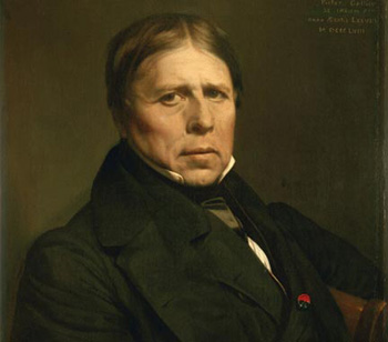
The assignment for the March meeting was to present two versions of the same image, one in color, the other in black and white. Firstly we reviewed the role of color in western painting, and saw that it took almost five hundred years for western painting to transform color from its totemic role in medieval manuscripts to the photorealism of Ingres, as shown in his self portrait, made around the time that photography was invented, and most likely based a photograph, as was Ingres’ habit in later life.
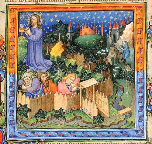
Medieval Manuscript
Photography on the other hand, as a means of fixing optical projection, started out in the 1830’s as a black and white medium which instantly provided perspective, shading, fine details: everything, in short, that painters took hundreds of years to develop, but without color, the foundation of western painting for hundreds of years.
This situation lasted well over a century, until the wide acceptance of color after World War II, first with Kodachrome 35mm slides, and subsequently with one hour color prints and finally, at the turn of the 21th century, with the digital revolution which brought color printing into the home and studio on a mass scale by means of the Epson inkjet printer.
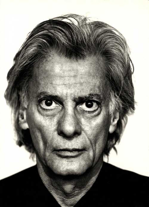
Thus senior photographers among us will have developed their skills and appreciation of the art of photography in a black and white world, an example of which is this Avedon self portrait. While younger ones,who started shooting in the last 20 years or so, might consider photography to be primarily a color medium.
We started by examining the matter of converting color photos to black and white. It was shown that simply converting a color image to gray scale, or desaturating it, did not produce a satisfactory image, as the relationships of the grays did not seem correct.
This is because the eye has a different sensitivity to different colors, being particularly sensitive to the color green.
What is needed, is a properly “panchromatic” color to black and white conversion with the correct relationship between the grays. This problem had been solved by Kodak in 1922 with their Panchromatic Cine film. And black and white photographers will certainly recall Kodaks Plus X Pan, a long time standard for fine grain medium speed black and white film. Now a days, Photoshop and Lightroom have black and white conversion routines that make a correct conversion the matter of a couple of clicks of the mouse.
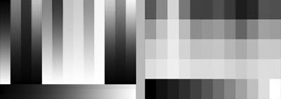
Here is an example of the results.
Color test sheet:
Simple removal of Color by conversion to gray scale
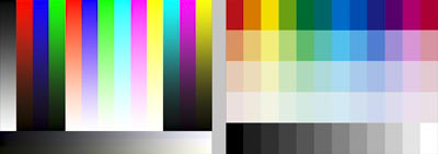
Panchromatic conversion:
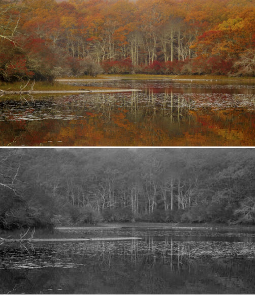
Note that in the Panchromatic version, the intensity of the grays is more like the color version. As we shall see later, being able to control the brightness of each color in the conversion process can easily be used for artistic effect, the most common of which is darkening the blues to make skies darker, something that was accomplished in the dear old days of film with a red or polarizing filter, or both.I started off by showing several pairs of photos that had been selected to show their suitability for presentation in color, or black and white. It was interesting to note the unanimity in the group in their preference for one form or the other. As this fall foliage scene was all about color, it should come as no surprise that no one preferred the black and white version: it was a total bore, no surprise there.
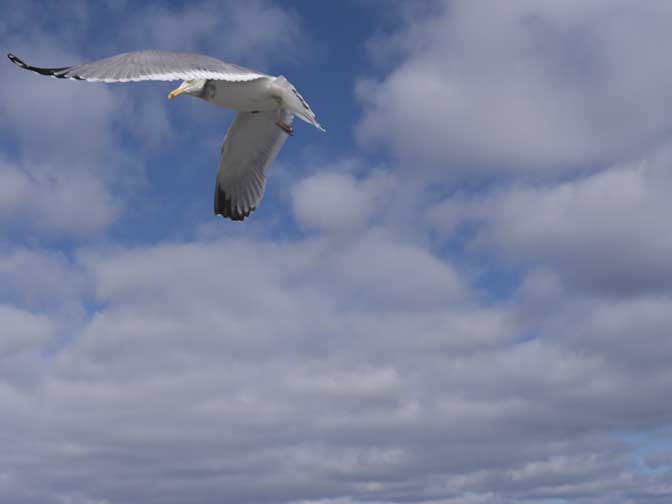
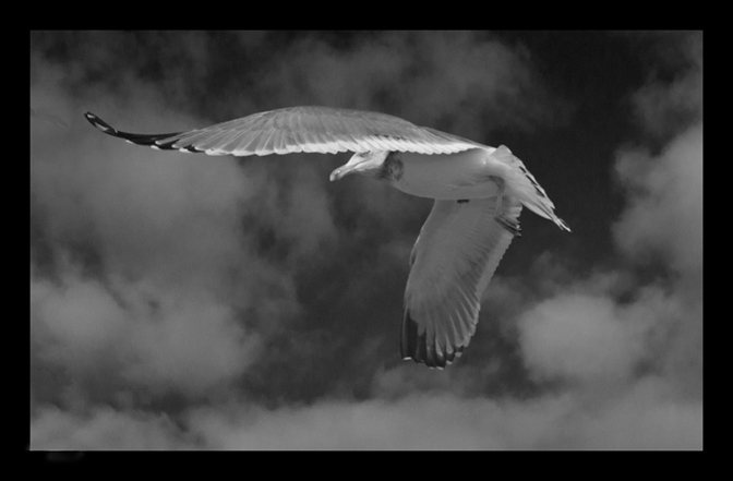
On the other hand, everyone preferred this photograph in the black and white version, no doubt because the bird stood out much more dramatically against an almost black sky.
As the evening progressed, it became clear that while there was quite a bit of unanimity among the members as to whether an image was stronger in color or black and white, and it was not always the color one, by any matter of means.
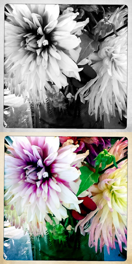
Marilyn DiCarlo presented a pair of flowers. Here, the color was preferred. Again this
picture was all about color in the first place.
Bridge presented some night portraits which argued for an intermediate position:
in addition to color an black and white, he present images in which the color had been desaturated in the shadow areas, to better simulate natural vision which does not
distinguish colors well in very low light.
Color:


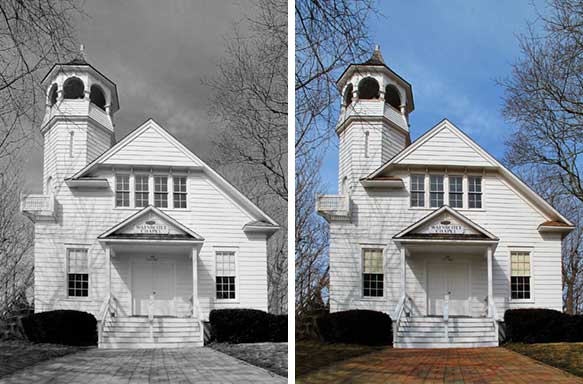
Dainis presented a number of images which recalled post cards of the past. This photograph seemed to benefit from a black and white conversion, because without the blue sky, the form of the Wainscott Church was emphasized over the expanse of blue sky, and that was the point of the picture.
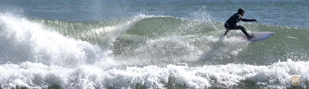
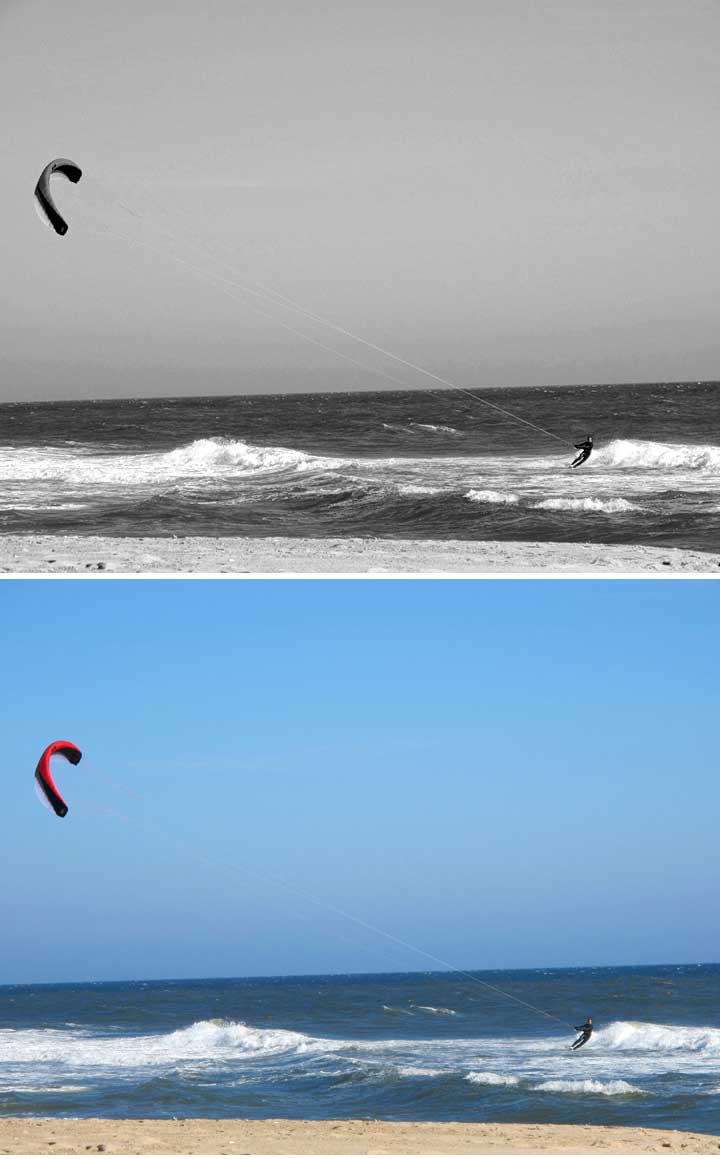
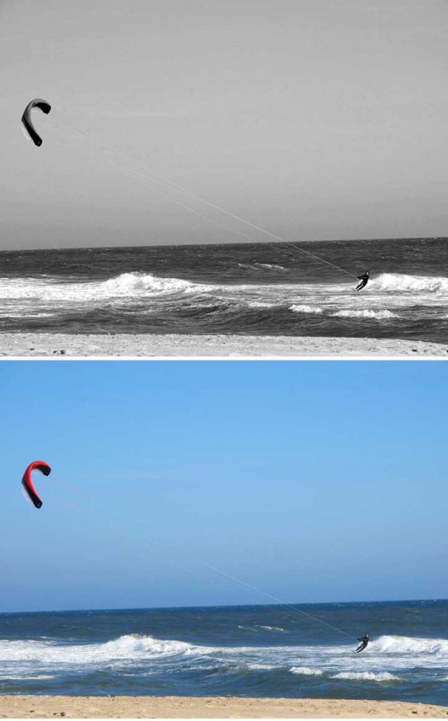
Loretta got the prize for actually doing the assignment correctly, and in a way that facilitated showing it to the other members, and presenting it in the meeting notes.This properly sized and presented pair was one that every one agreed was stronger in black and white, because the bright red color of the kite seemed to distract from the relationship between the surfer and the kite, and the blue sky obscured the lines that connected the two, thus reducing the strong pictorial effect of the diagonal formed by the surfer, the lines, and the kite. Normally, though, seascapes seem to benefit from color.
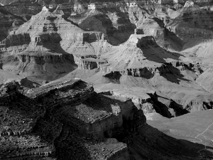
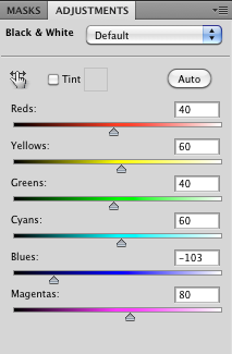
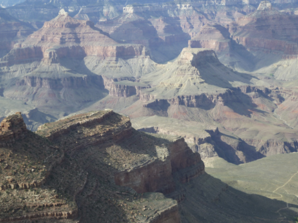
Beryl Brownman thoughtfully arrived early with some photographs she had taken on a trip west. I selected a few to convert. This one of the Grand Canyon seemed to be a candidate for conversion to black and white, as the natural lighting was somewhat dull, flattening out the strong forms in the photograph, although that was an interesting look in itself. After conversion to black and white, a bit of contrast was added, as is common in a black and white conversion. The blue channel in the Photoshop black and white converter was pulled down, to absorb the blue in the shadows, thus emphasizing the shapes of the plateaus in the canyon.
Original:
Black and white conversion:
Photoshop black and white converter:
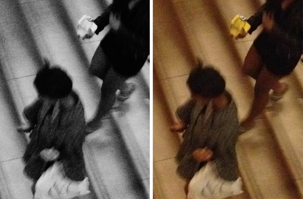
Yvette brought a pair of photos that were converted using a “film look” conversion plug in.
This group was unusual in that there was no clear preference for color or black and white, perhaps because of the fact the the color photo itself, was almost a monotone, and the photograph relied for its impact on form and movement, rather than color.
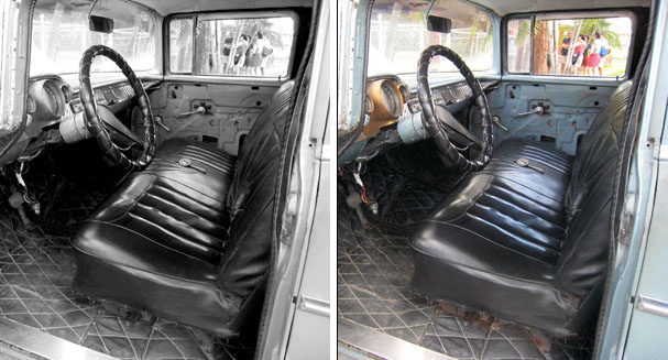
Joan Santos was unable to make the meeting, but she sent in a pair of images,
properly sized. Thanks Joan. What is interesting about this pair is that the color
version looks to me like a photo of the people in the distance framed by the car
window, while the black and while looks like a picture about the car. Note that
the contrast, as is often the case, was increased in the black and white.
We are all grateful to everyone who completed the assignment, especially those who took the trouble to resize their work for easy projection and inclusion in the meeting notes. Just a reminder,(for Dainis:-), work should be 8×10, 72 dpi, medium resolution jpegs. Anyone who needs help in resizing might come a bit early to the meeting, It isn’t difficult to do.
Our next event will be the Annual Ashawagh Hall Show the Weekend of March 24th.
Details will be covered in a separate email from Fred Vanderwerven. There will be a critique and discussion starting at 4pm Sunday. There will be no meeting in April, and the next meeting will be the May 14th meeting at the Bridgehampton National Bank.
-Jonathan Morse